Joyment is an early-stage startup building a mental health app designed to support users whenever they need it. Formally known as Resilient Moment, Joyment combines cognitive behavioral therapy (CBT) techniques with AI-powered machine learning to deliver personalized mental exercises that help users relax and recharge.
To prepare for a public launch, the Joyment team needed an onboarding flow to introduce new users to the app and its features.
Feb '24 - Apr '24
Visual Design, Prototyping, User Testing
STRENGTHENING YOUR MIND
Mental wellness is just as important as staying physically healthy, and building a habit of regular mental exercises can make a huge difference. Just like working out makes your body stronger, practicing mental exercises helps you handle stress, bounce back from tough times, and feel more balanced overall. Taking care of your mind makes it easier to take on whatever life throws at you.

The CHALLENGE
FIRST IMPRESSIONS ARE CRUCIAL
Mental wellness is a personal and sensitive journey, so it’s crucial for us to be transparent and upfront about the benefits and experience our product offers. Our goal is to ensure new users feel comfortable, confident, and familiar as they begin using the app. Since our app has not publicly launched yet, we did not have any active user data that we could leverage.
Our high level goals for the onboarding experience are to:
Highlight the app’s key features—our core strengths.
Reassure users that their privacy is protected, their data is securely stored, and it will never be sold.
Shorten the time it takes for users to understand the value of our product.
MY ROLE
I led the design of the onboarding experience from January to April 2024, collaborating with another designer to craft the entry points and map out the journey for new users.
I also worked closely with the CTO and Product Manager, aligning on the overall product journey and supporting the execution of the app build.
THE APPROACH
DEFINE OUR CORE STRENGTHS
The mental health app market is highly competitive, with many players focused on improving users’ well-being. To stand out, it’s essential for us to go beyond simply matching competitor features and instead focus on truly meeting our users’ needs.
As a user, I’ve experienced many onboarding flows, but this was my first time designing one myself. I started by researching common onboarding approaches used by other companies to get a sense of what works and build from there.
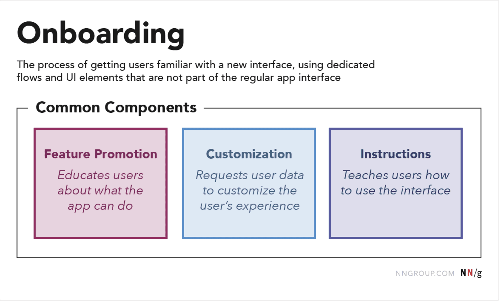
This is from an NN Group article we referenced while researching common onboarding design patterns in UX.
Rather than designing the onboarding flow as a tutorial, we focused on highlighting the app’s core features. This approach gives new users a quick introduction and lets them start using Joyment right away. Our goal is to get users engaged with the app as quickly as possible.
Based on the common elements of onboarding flows, we decided to focus on these two components from the article:
FEATURE PROMOTION
Since this is a brand-new app, we decided to focus on showcasing our core strengths to users who may not yet know what we’re about. As the company grows and our presence expands, we expect the focus to shift, with our value proposition playing a bigger role in marketing efforts.
CUSTOMIZATION
One of our biggest strengths is using AI and machine learning to personalize the user experience. To enable this, we ask for some user data upfront, allowing the app to tailor itself to their needs. We want to make this option clear early on, or at least let users know they can choose to provide it later.
THE DISCOVERY
WHAT DOES "MENTAL WELLNESS" MEAN TO YOU?
The discovery phase was fast-paced, where we mapped out product milestones, analyzed the competition, aligned with the team’s vision, and began exploring user needs, behaviors, and pain points. Designing the onboarding flow made us think about the bigger picture—how to guide new users from their first interaction and keep them engaged.
The whole team came together to workshop our company’s purpose and how to share it with the world. A recurring theme was how we define and express resilience. Mental well-being isn’t about always being happy or calm—it’s about navigating life’s challenges with self-compassion through the tough moments.
Our research showed that the idea of "mental wellness" means something different to everyone. People have unique motivations for building mental resilience, so we needed to define a shared concept or purpose.
Mental well-being isn’t about always being happy or calm—it’s about navigating life’s challenges with self-compassion during the tough moments.
VISUALIZING THE END-TO-END
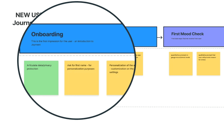
We used experience mapping techniques to visualize and communicate the user’s journey across different touchpoints, starting with onboarding. This helped us ensure that our brand and voice stayed consistent throughout the entire experience.
THE VISION
INTRODUCE A PATH TO RESILIENCE

While many of our competitors focus on offering as many wellness tools as possible, our vision is to prioritize personalization from the very beginning. Our app is designed to understand each user and provide tools specifically tailored to their needs.

KEEP IT SIMPLE
We wanted to keep the onboarding experience simple and focused, avoiding overwhelming users with too much information or educational content right away. Since we aimed to keep this stage under two minutes, we prioritized only the most essential information to ensure a smooth and efficient start.

READY TO GO
We wanted the onboarding experience to flow seamlessly into the starting the mental exercises so that the user is ready to start using the app.
THE FRAMEWORK
INTRODUCE CORE FEATURES FIRST
We wanted to balance introducing all the app's cool features with focusing on our core strengths. To do this, we made the core features the main part of the onboarding flow and offered an optional section for users to explore more if they wanted.
Using sketching and storyboarding, I explored different ideas for the UI layout, functionality, and interactions. Starting with a broad vision, we gradually refined it into something concrete.

Here are my early sketches exploring different navigation patterns and content. With a tight timeline, I focused on sketching quickly to align ideas before moving on to prototyping.

To keep things moving and ensure alignment, I shared my thought process behind each choice, which helped me improve at explaining my design decisions.
DETAILED DESIGN
MAIN ONBOARDING FLOW
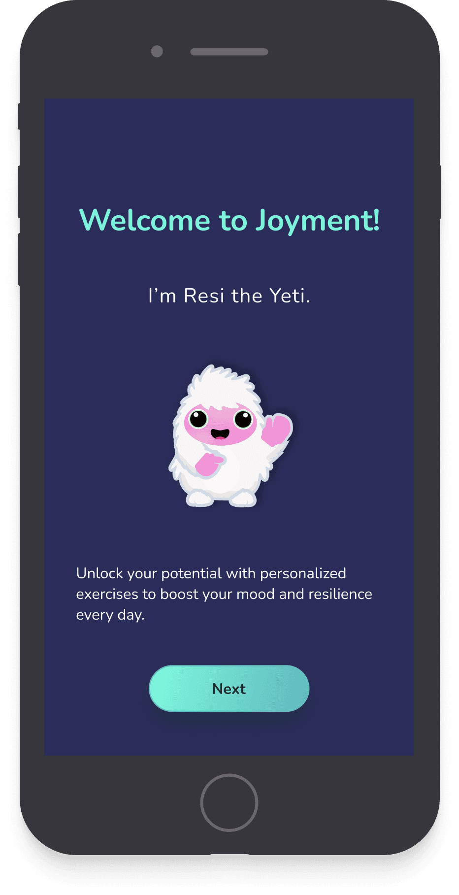
The gallery below shows the main onboarding flow prior for the app.

STREAMLINED ONBOARDING
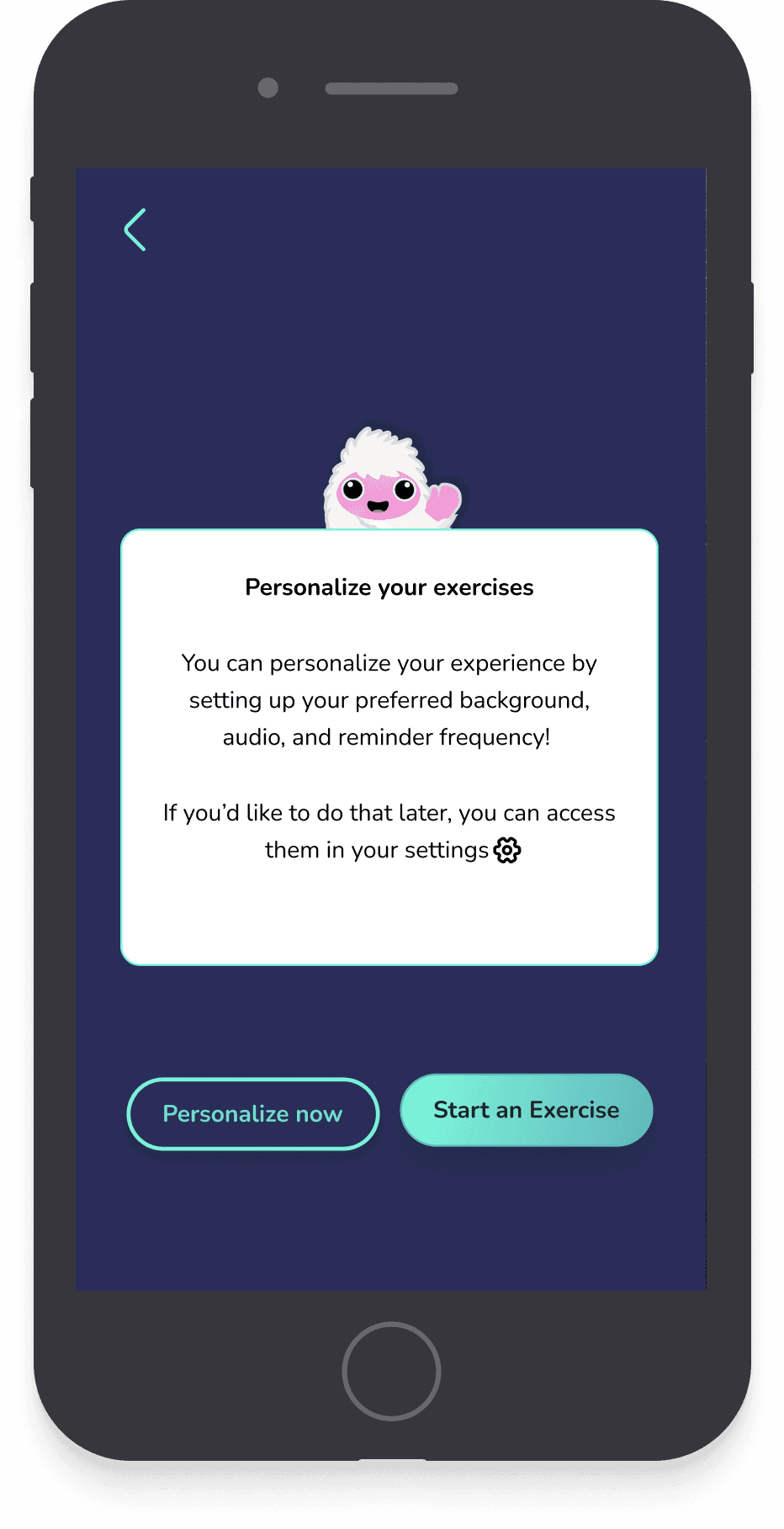
The main onboarding screens are designed to give users a quick intro to the app’s key features while gathering some basic info to kickstart personalization. From there, users can jump straight into the app or spend a bit more time customizing their experience.
DESIGNED FOR CONFIDENCE
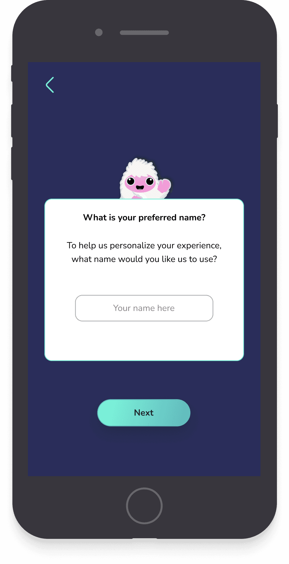
The interface is clean and straightforward, avoiding clutter or flashy visuals. We used brand colors and typography to create a cohesive look, while the spacious design and clear layout ensure a confident, positive first impression during onboarding.
[OPTIONAL] ADDITIONAL ONBOARDING SCREENS


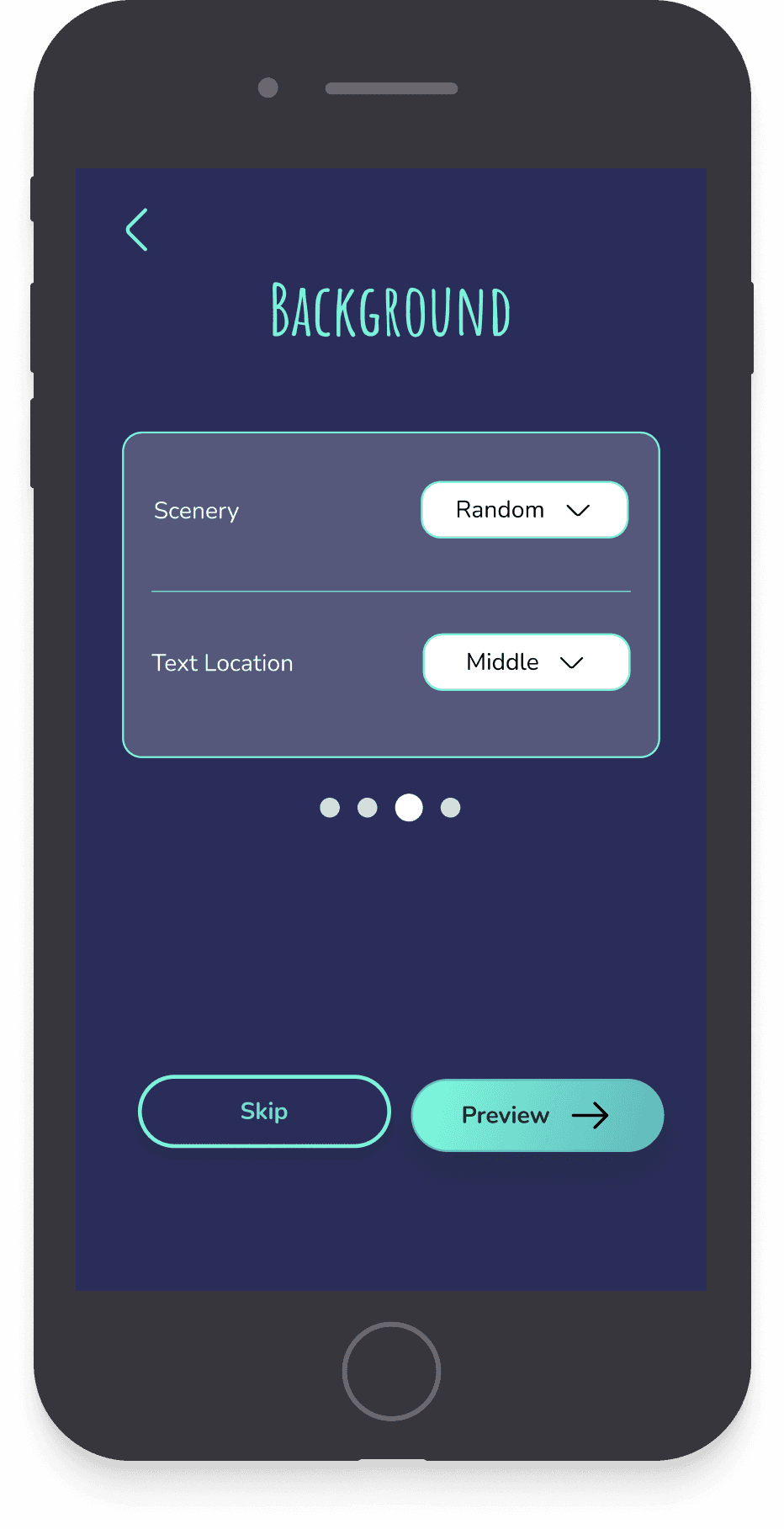
PERSONALIZATION OPTIONS
A core value of our product is ensuring every feature is user-focused and customizable to fit individual needs. This optional flow allows users to further personalize their experience before diving into the app.

THE LAUNCH
PUBLIC LAUNCH ON IOS
In the four months after my work on the project, the team continued refining the app’s visual design. Before wrapping up my time with Joyment, I contributed to redesigning the home screen to maintain consistency with the onboarding experience. It was rewarding to see my work come to life, especially knowing the onboarding flow played a key role in the app's successful public launch in October 2024.
REFLECTIONS
Grateful for the opportunity
Working with Joyment was my first big design project, and it was an amazing experience to collaborate with a team so passionate about creating a product that truly helps people.
After completing my online UX Design courses online, I was eager to put what I’d learned into practice on a real product. I’m grateful for the opportunity to work with such a dedicated group, especially the Design Manager, who challenged me to think critically about my design choices and approach my work with more intention.
This experience pushed me out of my comfort zone, especially when it came to seeking feedback, but it helped me grow and trust myself more as a designer.
UP NEXT
