Increase conversion through booking redesign
Highline Stays is a vacation rental platform focused on providing exceptional getaway experiences in the Georgian mountains. Currently featuring a single location, Melody Tay, the small business owner, envisions expanding her portfolio to build a thriving empire of unique rentals.
While taking UX courses through Coursera, I offered to help improve Melody's website’s user experience. It was a great opportunity to apply UX fundamentals to a real-world project while continuing to learn.
Oct '23 - Dec '23
User Research, Visual Design, Prototyping, User Testing

THE CHALLENGE
In addition to her own website, Melody also lists on sites like VRBO and Airbnb, where she sees much higher success rates. She’s not sure why her own site isn’t performing as well or how to boost her booking rate so she can rely less on third-party platforms.
How do we encourage potential guests to book through Highline Stays website?
First, I need to understand why users weren't booking through Highline Stays…
MY DESIGN PROCESS
RESEARCH
Conducted interviews with 10 users who visited the website but chose not to complete a booking, uncovering key insights into pain points and barriers.
Carried out a usability study during the interviews to evaluate the website’s functionality and user experience.
ANALYSIS
Identified recurring patterns of friction points from the interviews and usability study, organizing them into actionable insights.
Analyzed website data to pinpoint drop-off rates and understand user behavior.
SYNTHESIS
Created design solutions that were directly informed by the insights gathered during the analysis phase.
Tackled the most common friction points first to make the biggest impact.
PROTOTYPE
Made a usable prototype to test my assumptions by getting it in the hands of the customer.
Made quick tweaks and improvements to the prototype based on user feedback
THE DISCOVERY
INSIGHTS FROM MY RESEARCH
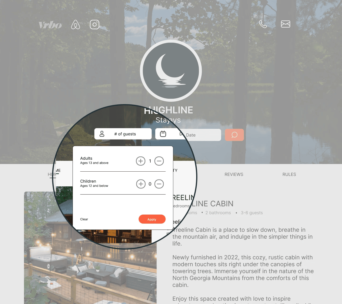
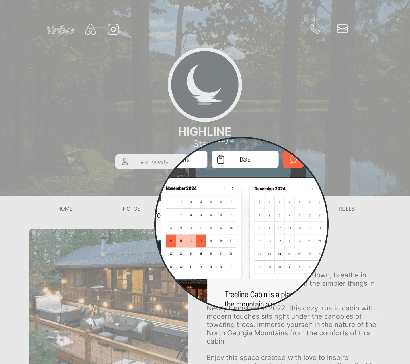
Users kept getting lost on where to start booking. They’d find their dates on the Availability page and try to book, but there was no option to continue from there. Instead, they’d have to go to a different page, which disrupted the booking flow.
Another common issue my research uncovered was that, while the website had a lot of relevant information, it was difficult to sift through. The disorganized layout made the site feel unprofessional and not fully established. It didn't
So…armed with this new knowledge, I started to design solutions to solve these user problems.
OLD DESIGN
ONLY ONE OPTION TO GET TO BOOKING
The past design only had one entry point that allowed a potential renter to book.

Most users are trying to access booking from the Availability page…which does not have a booking entry point.

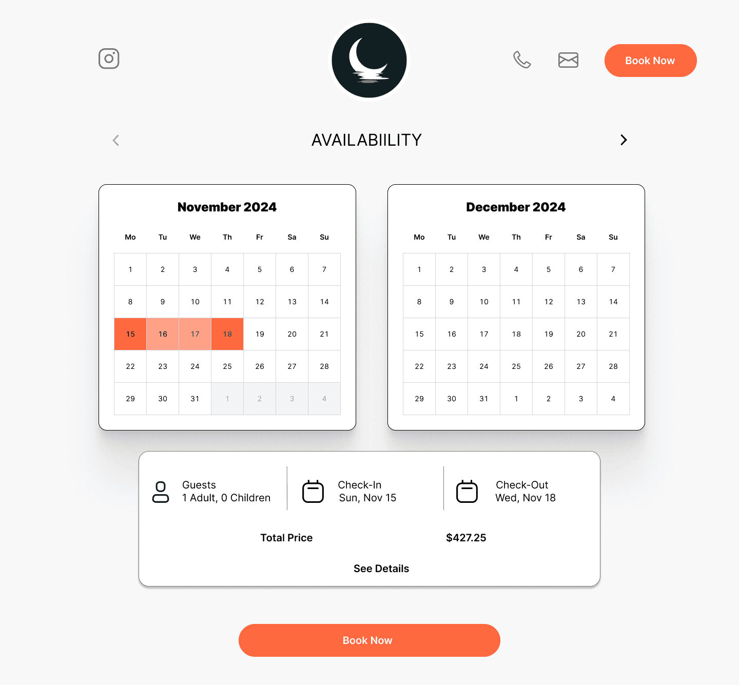
NEW DESIGN

The updated design enables users to input their information AND check for available dates seamlessly on the same home page before routing them to the booking section.
I also revamped the Availability page for a clearer date display as well as introducing a Summary card… consolidating all essential booking details for user convenience.

OLD DESIGN
OVERWHELMING AMOUNT OF INFORMATION
Users mentioned that the amenities section was helpful but felt a bit overwhelming with all the info. I saw this as a chance to simplify and rearrange things to make it easier to digest.
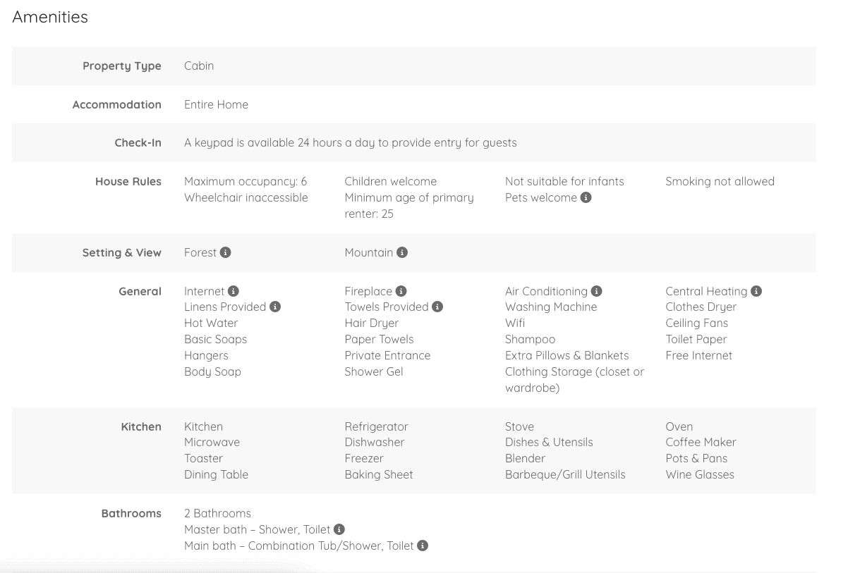
NEW DESIGN

REFLECTIONS
From Overwhelm to Clarity: My Early UX Journey
Pivoting my career into UX design was both exciting and a little overwhelming. While taking my online UX course, I decided to apply what I was learning in real-time by working on my friend's vacation website. It was a great way to put theory into practice and gain hands-on experience while studying.
At the start, I was bursting with ideas, eager to make big changes to the site's features. But I quickly took a step back to make sure my decisions were in line with user needs. To do this, I focused on research - combining interviews and data analysis to get a clear picture of user frustrations and the challenges they faced on the site. This deep dive taught me a valuable lesson: the importance of connecting user pain points with functional improvements
Throughout the journey, I leaned on advice from experienced UX pros, who became a huge part of my learning experience. Their insights and feedback helped me refine my skills and my approach to user-centric design, data-driven decisions, and power of collaboration. This project was my entry into the UX world, and it solidified my belief in empathy and iterative design as key to creating meaningful user experiences.
UP NEXT